


+60% learning efficiency. +35% usability satisfaction. +36.8% aesthetic satisfaction.
Alchemist Improvement
B2C | EdTech | 2023-2024 | The live website (will implement the new design later)
Alchemist is a website that enhances algorithm and data structure learning for developers, CS students, and job seeker through real-time interactive visuals, making complex concepts more accessible and enjoyable.
Practice Areas: User-Centered Design, UI & IxD Design, Design System
Tools: Figma, ChatGPT, Miro, Midjourney
Team: Developer
The Improvement Goal
Evolve Alchemist into an engaging and user-friendly platform for algorithm and data structure learning and practicing.
Problems: The initial version of Alchemist had a clean UI and interactive visuals. However, it struggled to help users understand and practically apply abstract concepts. Additionally, the absence of signup and user profile pages hindered the overall learning experience.
Solutions: Identified and improved over 10 usability issues through user testing and interviews. Integrated 20+ features that enhance learning flows and increase playfulness.
Results: 60% increase in learning efficiency, a significant 35% boost in overall user satisfaction, and a 36.8% improvement in aesthetic satisfaction.
NEW DESIGN
Ensure Easy Navigation

Efficient & Joyful Learning
New Features Support Study Experience
CURRENT DESIGN
Inconvenient Navigation
* Click to play and pause the videos
Confused Learning
* Click to play and pause the videos
How I Achieved that?
Identify current website usability issues.
Understanding users'struggles and needs.
Figure out the proper solutions.
Iteratively design
Senario solutions
Unique features
Users' wants
Problem Statement
Current Experience.
Confusing & Inconsistent & Unintuitive & Inefficient
Positive Experience
Negative Experience
No access for searching a specific problem.
Crowded problem
cards caused dizziness.
The hamburger menu icon for the filter caused confusion.
Users liked the multi-select feature.
Users had to back to the filter board to edit their selections was inefficient.
Insufficient information was provided for users to grasp the knowledge and apply concepts to real-world problems.
The interaction was unintuitive, requiring users to engage in extra cognitive effort to accomplish tasks.
Inconsistencies arose due to the lack of titles, tooltips, and other elements on some pages.
Users were unsure where to start or what actions to take.
Real-time interactive feedback has helped in understanding algorithms.
Users liked the clean UI.
The experiences identified through user interviews and usability testing.
The biggest problem was that Alchemist didn't provide an efficient learning flow.
Understanding
Users' struggles, needs, & real wants
Through my immersive research which included digital exploration, a survey that captured 13 precious responses, and heartfelt conversations with users, I found that users face numerous challenges from grasping concepts to applying them in real-world scenarios, the struggles born from The inherent complexity and abstraction of concepts. Users also find it hard to stay motivated with a vast array of problems to learn. Moreover, limited time, difficulty finding the right resources, and a lack of guidance add to their struggles.
Code every day
Keep a consistent amount every day, make it a habit, accumulate over time.
Honestly more examples would have helped me learn better and a step by step line explanation.
If you can explain the fundamentals coherently , then you are providing valuable information found nowhere else.
Give all the knowledge I need to my brain at once.
Users' needs
-
Clear, coherent concept explanations that are related to real-life scenarios will significantly help users understand abstract and complex concepts.
-
Real-world application cases are crucial for understanding how to apply algorithms and data structures to practical situations, aligning with users' work requirements and motivating their learning.
-
Structured learning resources can help maintain their motivation and reduce the time of searching for right resources.
-
Consistent practice opportunities helps reinforce learning and improve comprehension.
-
Effective help ensures they overcome obstacles and stay on track with their learning goals.
30.8% of Users Want...
A fun or playful learning experience.
"I just want my experience easy and fun."
"Finding fun ways that algorithms apply".
.. .. . .. . ..
.. .. .
After discussing the insights with the stakeholder, we opted to reframe the platform's messaging from "learn & practice algorithms and data structures" to " learn & play algorithms and data structures." This strategic shift aligns more closely with users' needs and wants. By incorporating the term 'play,' we aim to foster a fun and engaging vibe that enhances the learning process.
Problem Statement
After identifying website issues and understood user needs, we targeted key problems to address.

How can we provide users an efficient learning flow, and accommadate a playful environment?
A Notable Gap found From Our Competitors
No existing platform blends real-time interactive visuals and textual explanations. However, a multichannel learning platform tailored to diverse learning patterns is highly beneficial to users. Therefore, we decided to seize this opportunity to make it our unique feature.

Who Are We Solving The Problem For?
Motivation
-
To improve problem-solving skills.
Needs
-
Master in algorithms & data structures.
-
Ample real-world problem examples and solution explanations
-
Make it a habit.

David Jones
Pain Points
-
Struggle with applying algorithms to real-life problems.
-
Boring and dry experience.
-
No guidance.
-
Difficult in maintaining motivation.
-
Time limitation.
Goals
-
Master medium to hard level algorithms within 2 years.
Front-end Software Engineer
Algorithm Level Easy
Wants
-
Efficient and enjoyable learning process.
Solutions In Scenario
After drawing inspiration from our wise competitors' solutions, I have formulated various ideas. To ensure alignment with Alchemist's vision, I imagined David's immersive learning journey with Alchemist through a user journey map to uncover unique solutions. The unique features are highlighted below.
.jpg)

Principles Guided The Redesign Decisions
Efficiency
Provide efficient learning and task flow.
Multisensory
Enhance user engagement.
Clarity
Everything should be easy to understand.
Instant Feedback
Important for real-time interactive modules.
The Redesign Decisions
We couldn't implement all solutions at this stage since it will take a long time to implement them all. So we decided on these that are the most priority and practical. We evaluated factors like urgency, significance, required design effort, and development effort.

Decisions Not Employed:
Contest and Score Mechanism: Avoided to prevent creating a stressful environment.
Quizzes: The real-time interactive module already functions as a quiz.
Code practice, Study Mates, Mentor System, and Commitment Contracts: Not adopted at this stage due to complexity, but considered for future development.
We Decided On:
-
Introduce an instructional board that displays storytelling algorithm problem prompts and step-by-step explanations, linking abstract concepts to real-life scenarios to attract beginners.
-
Enhance the learning page to provide step-by-step guidance, incorporating real-world application cases that explain how algorithms solve problems, why they're chosen, and their applications. Include supportive features like discussions, related topics, and tutorial materials for a better learning experience.
-
Create a user profile page allowing users to make and edit study plans, track progress, and review learned problems to increase engagement and personalization.
-
Improve facets and search functionality by redesigning filters, adding sorting options, and including a search bar to help users quickly find and navigate problems.
-
Simplify the color scheme and tailor interactions to specific concepts. This facilitates user comprehension and enhances the learning experience.
User Flow
To comprehend the initial experience of users, such as David Jones, who wish to explore Alchemist's algorithm problems before signing up, I created a user flow. This flow illustrates David's navigation through the platform to find a problem to learn and play, guides his decision-making process about signing up, and subsequently assists him in custom a study plan to start learning.

Learning & Playing to Sign up flow
Design & Challenges

1, Low-fidelity Prototype
The Use Case lacked clarity on how and why to apply a specific algorithm, leaving users unsure of practical usage.
"I still don't know how to apply this algorithm to solve real-life problems."
The users showed relaxation and joy for the step-by-step learning guide page.
"oh! This is much better. This one is obvious. I'll look at the description on the left, and then when I'm done, I'll look at the instructions on the left and then I'll do the problem. This step-by-step explanation will also help understand the concept."
Challenge
Balance simplicity with functionality
How to guide users through the learning flow visually?
The current learning page is clean but lacks sufficient guidance, leaving users confused about where to start and what to do. To address this, I explored two solutions: reorganizing buttons and directly displaying algorithm details. While the first solution maintained the clean design, it relied heavily on tooltips and button clicks, leading to inefficiencies. The second solution, though effective, risked cluttering the interface.
Solution: Drawing inspiration from gaming and educational platforms, I adopted a split-screen layout. This design prioritizes content on the left and maximizes user interaction space on the right, ensuring concise text and unified buttons. These changes effectively addressed the challenge. User testing confirmed the third version as the favorite.

Maintained the clean style but it's more suitable for playing algorithms than for learning.
Suitable for both playing and learning but UI overwhelming.


Visually clean with clear task guidance.
Aligned categories by frequency of use from high to low.
Redefined and Reordered Categories based on the survey findings.

Individual buttons and dropdown lists caused users to miss the multi-selection feature.

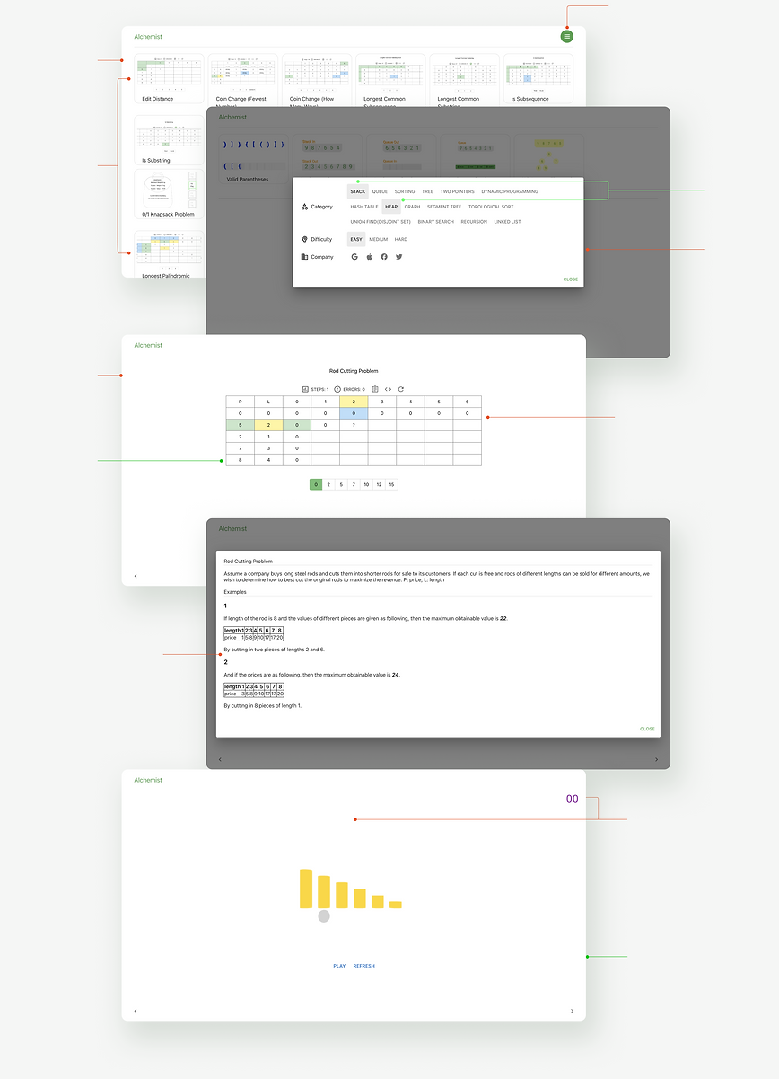
2, Design Exploration - Filter& Sort
To provide users with an efficient way to find their interested algorithm and data structure problems, I redefined and reordered the filter and sort categories, placing them prominently at the top of the entry page. However, user testing revealed that users missed the multi-selection functionality, wanted a quick way to clear results, and needed to see the number of results after selection.
Challenges
Achieve complexity & efficiency & aesthetic
How can I keep the category buttons at the top while increasing the discoverability of multi-selection?
It's challenging to integrate filters and sorts while improving navigation efficiency due to the complex logic of multi-selection and various user choice combinations. Hovering over any category reveals a dropdown with all suboptions, highlighting multi-selection. However, the 'Beginners' Path' can only be single-selected, while sort categories like 'Popularity' and 'Newest' need to allow both individual and multi-selection. Maintaining a clean UI adds complexity because sort categories lack suboptions, and some filter suboptions have lengthy text.
Multi-selection

Single Selection
Hover animation and used gold to symbolize "Turning learning into gold," but it cluttered the color scheme.
Long text messed up the UI.
The elegant solution
After thorough consideration and experiments, I devised a solution: I grouped filter category buttons requiring multi-selection, enabled a dropdown display upon user hover, and kept sort category buttons separate. This approach allowed for both single and multi-selection. Meanwhile, I removed strokes from categories and suboptions, allowing long text to be displayed tidily, and adopted a unified white dropdown board to facilitate the multi-selection and streamline the UI. I canceled the "Turning learning into gold" concept in the filter and sort area, reserving it for the learning and playing modules, leaving the filter and sort area clean and focused. By making these changes, I made the multi-selection more discoverable, kept the UI clean, and overall improved user navigation.
Introduce the redesign
Alchemist
Tailored for CS students, job seekers, and developers.
Revolutionizing
Algorithm & Data Structure Learning & Playing
The new Alchemist platform breaks down complex concepts into small steps, bridge abstract concepts with real-life scenarios, keeps learners stay motivation.

Efficient Learning Flow


01.
Simultaneous textual explanations, interactive visuals, and code demos enhance concept mastery.
Clearly guides users through learning tasks.


02.
Real- world applications bridge the gap between theory and practice.

03.
Access various learning tools, including videos and related problems.
Conclusion
This overhaul has led to
-
a remarkable 60% increase in learning efficiency
-
a notable 35% boost in overall usability satisfaction
-
a significant 36.8% improvement in visual aesthetics satisfaction
Enhancing UX and redesigning Alchemist's UI have been an exhilarating journey, accompanied by numerous challenges.
These challenges included understanding users' struggles, uncovering true needs and wants, developing a novel way of learning algorithms and data structures through playing, and coping with constraints on user research resources.
By conquering these challenges through conducting in-depth & extensive research, empathizing with users, maintaining continuous stakeholder engagement, collaborating closely with the developer, and applying robust design and prototype skills, strategic thinking, and creativity, I have successfully transformed Alchemist into an efficient and enjoyable platform for learning algorithms and data structures.